Tech PR & Digital Marketing

We are a full-service PR and Digital Marketing agency for Tech companies in Africa
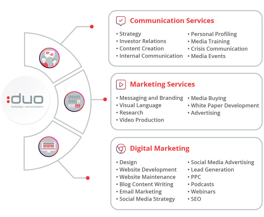
Communication Services
Our team of Tech PR professionals, focus on strategy, public relations, media relations, media training for our clients in the technology sector.
Marketing Services
We specialise in media buying, visual language, research, white paper development, messaging and branding, video production and advertising.
Digital Marketing
We help you grow your brand’s online presence and drive business growth with website dev, social media, lead gen campaigns, website maintenance, PPC, podcasts, webinars and SEO.
What partnering with DUO will provide you with
- Award-winning Tech PR and Digital Marketing Agency with 20 years of specialist Tech experience.
- Experienced strategists and account managers to deliver results that match your business objectives.
- Integration and amplification of PR with Digital including social media, media buying of advertorial and advertising placement, lead generation campaigns, and more.
- African PR expertise extending to Botswana, Ghana, Kenya, Namibia, Nigeria, Zimbabwe, and more.
- Full spectrum of PR services including crisis management for tech brands, as well as Investor relations for listed companies.
- Award-winning Tech journalists to help translate your technology value into business value.
- Content writers, designers, SEO experts (using AI for optimum results) and Pay-per-click (PPC) management to elevate your brand's visibility online.
- Monthly reports to match real business objectives, and full accountability of your investment and brand elevation needs.
Giving Tech Innovators a voice for over 20 years
Our strength lies in our ability to translate technology value into tangible business value and then harvest these outputs in the media and other relevant digital platforms for optimum brand exposure.
Our mission is to be the complete marketing and communications partner, facilitating growth and enabling greatness for tech companies by harvesting business value out of technology. We believe a holistic strategy reaps the best results and return on investment.


We are one of the top Cape town PR agencies. We service tech brands in Africa. Our service offering covers strategy, planning, communication and digital marketing.
We know and understand the tech market and media landscape well, having worked with tech clients since inception covering everything in the PR & marketing space.
Read our customer success case studies
Be inspired by the successes we have helped our tech clients achieve.

Integrated digital marketing and PR campaign builds targeted brand awareness for Braintree

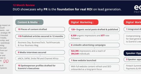
Ecentric: PR is the foundation for real return on investment through lead generation


